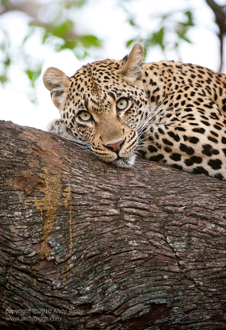
I get asked many questions about my Adobe Photoshop Lightroom workflow, and I thought it would be a good exercise to jot the steps down, along with some random notes. This is a workflow that I use if I am out in the field and won’t be using my favorite plugins such as Nik Software’s Viveza 2 or Silver Efex Pro 2.
Library Module
Import
Optional: metadata (copyright information goes into images)
Optional: Preset development ‘recipe’
Previews: standard
Develop Module
Crop (use ‘R’ key for quick access)
Crop image
Level the horizon
Spot Removal - You can use either Clone or Heal. Just do whatever it takes to get what you want. Use the bracket keys ( [ and ] ) to increase/decrease size of the brush.
Lens Corrections
Camera Calibration - Optional: camera profile, other than standard. You can create your own profile(s) with X-Rite ColorChecker Passport ($99)
White Balance - This is a creative tool, not a scientific tool. Just do what looks good. 5000 is mid-day light, and anything higher is warmer and anything lower is cooler.
Exposure - This sets the whitest / brightest area of the image. Hold down the ALT key when setting the Exposure to see what will be clipped or thrown away. Image my look horrible.
Blacks - This sets the darkest / black area of the image. Hold down the ALT key when setting the Blacks to see what will be clipped or thrown away. Image may look horrible.
Brightness - This is what sets the distribution between the black and white points in the image. It is what makes the image ‘look good’.
Recovery - Optional: use the Recovery slider to recover blown highlights. Pay attention that the overuse of this tool will make all whites look grey and dull (I see this all too often).
Fill Light - “Poor Man’s Fill Flash’. Use this to a minimum if possible. Overuse will cause an image to lack contrast.
Contrast - This is a very very blunt tool, and my preference is to use the Tone Curve (see below) to introduce contrast.
Clarity - Don’t do it. It’s like riding a scooter. It may be fun, but you don’t want your friends to see you doing it (just kidding). In all seriousness, overuse of this tool will cause your images to look outdated in a couple of years when this look is out of fashion. In other words, I only use it sparingly, and typically only with the Brush tool on specific areas.
Vibrance - Newer version of Saturation slider. Non-linear in nature. It will increase saturation of less saturated colors faster than the colors that are already saturated.
Saturation (if not using Vibrance) - I never use this, as it is a blunt tool that will make it easy to blow out your most vivid color in your scene.
Tone Curve - I start off by increasing Lights and decreasing Darks by opposite, but equal amounts. (ex: +10 and -10). I typically am more dramatic with the Lights and Darks and the Highlights and Shadows are closer to zero. When working with B&W images, all bets are off and I do whatever it takes to get contrast. I usually start off with a Medium Contrast curve, but sometimes do use the Linear or Strong ones. It just depends.
HSL (Hue / Saturation / Luminance) - Use the targeted adjustment tool. Click on the little circle to ‘undock’ the tool. Go to your image and click and drag up or down to affect the H / S or L values of all similar tones/colors in the image.
Poor Man’s Polarizer = Increase saturation on sky and decrease Luminance on sky. Make sure you have a nice blue in the sky to begin with.
Split Toning - Used only for my B&W images. I use nothing for Highlights and a range of 40-50 for Hue and Saturation of between 5 and 20 for the Shadows. This creates a nice split tone warm image, without dulling the highlights.
Detail - I usually only vary the Amount and Masking. To use the Mask, hold down the Alt key to see what is going to be sharpened.
Noise Reduction - I only vary the Luminance slider, and rarely go beyond 15 or 20. If the image is underexposed by more than a stop, you may need to slide the Color slider to the right to eliminate stray pixels that are blue or red (easy to detect).
Post-Crop Vignetting - use sparingly. Remember it is uniform around all edges, so it might be visible. I use something like a negative 5 to 10 for the amount, and the Feather of around 80 (less sharp gradient).
Grain - I sometimes have to add grain to a B&W image that I am printing really really big. The goal is to fill in the gaps and mask out some of the issues with a lower megapixel file.
Red-Eye
Graduated Filter (M) - I use to darken skies. I only use Brightness, and never Exposure, as Exposure weakens the whites in clouds. Click and drag from beginning of where you want to darken and end where you want to end. The longer the drag, the longer the gradient effect is. Hold down SHIFT key to make the gradient a 90 degree / straight line.
Adjustment Brush (K) - I use this brush for many purposes. I can:
dodge and burn
paint contrast into a small area like a face of a cat
brighten eyes
increase clarity on clouds
Hold down ALT key to remove areas that you didn’t mean to brush. Use bracket keys to increase/decrease brush size.
Keyboard Shortcuts
R = crop
G = grid view (Library module)
E = Loupe view (Library module)
D = Develop module
Tab = toggles left/right panels
F = different full frame views
CTRL and ‘+’ = zooms in when using a tool that can be zoomed in
‘space bar’ = move around within an image
 Monday, August 22, 2011 at 12:14PM
  Thomson Safaris in
  News,
News,  Safaris