Social Networks and RSS Feeds
Instagram Instagram
About Andy


I am an avid adventurer, conservationist, teacher, and outdoor photographer whose photography celebrates the African landscape and its rich wildlife, people, and culture. My photographic safaris allow my travelers to not only enhance their understanding of photography, lighting, and wildlife, but to develop a life-long admiration for Africa ‘s beauty and culture.

Banana Republic recently used my photographs as the cornerstone of their Urban Safari campaign, and my images were seen in all 750 stores around the globe, as well as in their billboards, catalogs and annual report. I was also the winner of the BBC Wildlife Photographer of the Year in the ‘Wild Places’ category in 2008 and a highly commended in the ‘Creative Visions of Nature’ category in 2007.

I launched Gura Gear in 2008, in an attempt to deliver lightweight camera bags to the market. I was looking for a lightweight camera bag to hold all of my photographic gear, and there was nothing desirable on the market that suited my needs. After spending 2 years with many prototypes, the Gura Gear Kiboko bag was born. More products are now available on the Gura Gear web site.


Search
Friends

Entries in Technique (2)

Monday
Dec122016

Photographic Processing and Believability

We are living in the golden age of photography; digital photography has matured and the tools available are robust and functional. The intersection of these magical cameras and raw file processing software brings up the subject of believable photographs. Why should a photograph need to be believable? It doesn’t, but this is often how viewers look at photographs. If an image is believable then the viewer can get past that hurdle and on to opinions of interpretation, quality, aesthetics, and how they actually feel about the photograph.

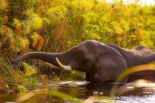
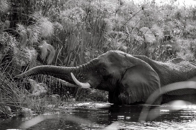
For example, I recently encountered an elephant (below) while on a boat in the Okavango Delta in Botswana. The color in this version of the photograph is unbelievable; I set the Saturation slider beyond what I would normally do. To illustrate my point, I doubt that many people will take a look at the actual content of the photograph after seeing how inappropriately I processed the image because the colors aren’t believable.


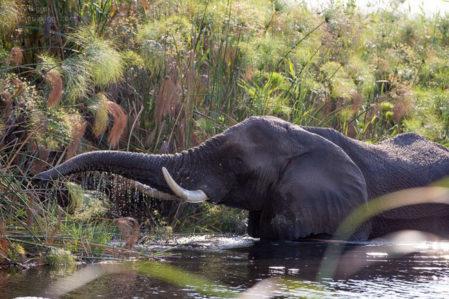
The second version of the same photograph (below) was edited more consistently with my normal processing style and language, and the image is more believable. You can move on to discussing how you feel about the image, whether or not you like it, what you think about the main subject, and so forth. But herein lies a challenge and a bit of a paradox for me: color photographs are often believable, but this also has the ability to limit our creativity at the same time. Interpretation of a scene or subject can be done in many different ways, from which lens you use, how far away you are, how you dodge, burn, select an overall color palette, and to where you crop (if at all).


The main point in discussing this is to propose the idea that believability changes when you work in color versus black and white. To use a metaphor, consider a box. What exists inside the box is everything believable and outside is everything not believable. For me, the box in the color world is much smaller than a box for black and white. Black and white photographs can be worked in more aggressive and more interpretive ways before a viewer fully understands or appreciates the amount of work done on the image. By removing the color, the reference points are also removed and the photographer is free to push outwards to expand that box and have more creativity and fewer constraints.

In the third example (below), the photograph has been processed in black and white and has much more work done to it in the areas of dodging, burning, and adjusting specific areas of contrast so that you can get past the believability factor and move on to more important things to consider, such as whether you like the image or not, or if it touches your soul.
 

Check out my new video series, Lightroom Simplifiedfor a more in-depth approach to creating believable images both quickly and efficiently. 13 videos, 3.5 hours of step-by-step instruction. 


Friday
Sep042009

Photo of the Day


Legadema

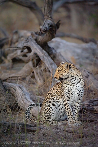
Mombo Camp, Botswana. July 2009

Nikon D3, 200-400mm f/4 VR, 1/200sec @ f/4, ISO 12,800

I know, I have been inundating this blog with photos of Legadema lately, however I thought this image would be an interesting study because of the technical details of the image. Did you notice that it was captured at ISO 12,800? Yes, this is a bit extreme, but the sun had gone down 15 minutes earlier, and rather than go back to camp we sat and enjoyed her company for a little while longer. I used Noise Ninja to clean up the noise a tad, and I used Nik Software's Viveza to brighten her up and have her more visually separated from the backgroud.

Photographing a leopard is likely some of the most challenging situations in wildlife photography. You either have one in a tree with extreme light/dark contrast, or you have one on the ground with grass and twigs in the way. Nature is inherently messy, and it is our job as photographers to try and eliminate the clutter by using our shooting position and our focal length to try and isolate our subjects.

As a rule of thumb, I like to instruct my safari travelers by rating items that show up in a scene. You can think of each item in your viewfinder as being positive, neutral or negative. Eliminate the negatives, get as many positives as you can, and neutrals are just going to be there. The branch that is coming out of her head is a negative, however you can reduce it somewhat by using visual tricks to get a viewer's eye to not notice it as much. In this example I brightened her up and darkened the background, as to give visual preference to one thing over another.

Trick: make your subject brighter than the background, as brighter objects tend to attract a viewer's eye. This is why lions sitting in the shade, underneath a tree with a bright background generally isn't a very successful photograph. Wait until your subject has a clean background that is also darker than your subject, and you have instantly created a luminance contrast that is in your favor.

Trick: try to find your subject in a different hue than the background, and you now have a case of hue contrast. In the image above the reflected light in the background (and on the subject) has blue-ish, and the subjects bright yellow coat (even though it is in cool shadow light) is warm. Now you have a warm / blue hue contrast that also helps separate the background from the subject.